
Elegant Wayfinding Signage for San Jose Tech Offices
Custom wayfinding signage that blends oak wood, vinyl lettering, strong contrast, and careful placement for San Jose tech offices where visitor flow and brand experience both matter.
Key takeaways
- Wayfinding signs help visitors, vendors, and employees move through tech offices without relying on repeated verbal directions.
- Oak wood paired with vinyl lettering works well when floor labels need to feel permanent but tenant or department names may change.
- Standoff mounting adds depth and improves visibility in elevator lobbies, reception areas, and hallway decision points.
- Color accents and inset details can support brand personality while still keeping the sign readable at a glance.
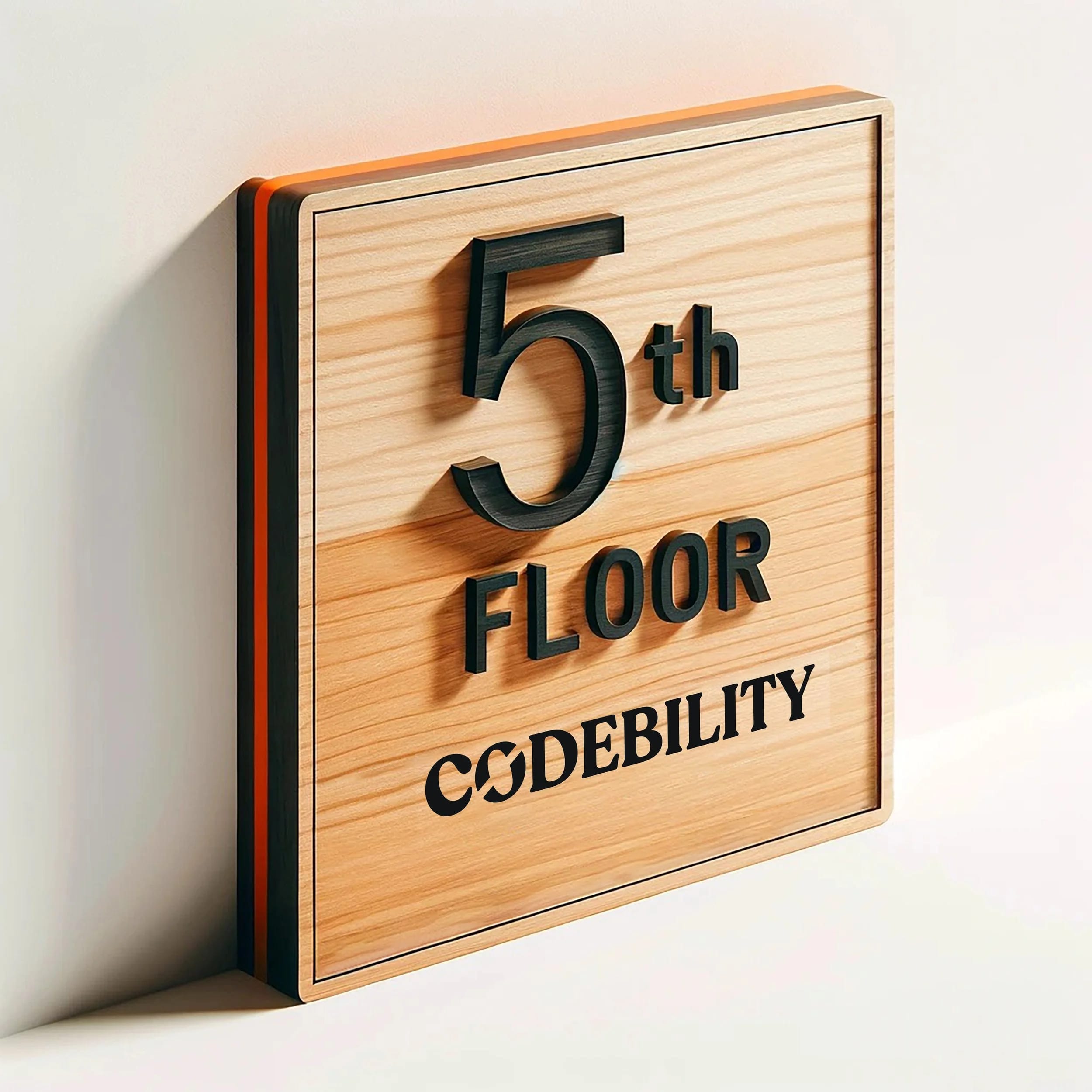
Wayfinding signage helps visitors, employees, vendors, and interview candidates move through an office without stopping to ask for directions. In San Jose tech offices, where a single workplace may include reception, labs, conference rooms, shared kitchens, secure areas, and multiple tenant suites, the best signs do more than point the way. They make the space feel organized and intentional.
This article looks at an interior wayfinding approach built around oak wood, vinyl lettering, and a bold orange-and-black color scheme. The material mix is especially useful for modern Bay Area offices because it balances a polished brand look with practical updates when teams, tenants, or room names change.
What makes wayfinding signage effective?
Effective wayfinding systems reduce hesitation. According to YAROOMS, common wayfinding sign types include directional signs, informational signs, identification signs, and regulatory signs. The sign style discussed here is primarily identification signage: it tells someone where they are, which floor or suite they have reached, and which company or department occupies the space.
Good office signs have a few things in common. They are visible from a reasonable distance, readable quickly, and consistent with the architecture around them. In San Jose, Santa Clara, Sunnyvale, and Mountain View office environments, that often means clean typography, durable interior materials, and color accents that feel current without making the hallway look cluttered.
Materials: Why oak wood and vinyl?
Oak is a hardwood with natural grain, so it brings warmth into offices that might otherwise be dominated by glass, concrete, metal frames, and white walls. It is sturdy enough for busy commercial interiors and can be stained, routed, painted, or paired with dimensional details. For permanent elements such as a floor name, suite identifier, or building marker, routed or stained wood creates a sign that feels integrated instead of temporary.
Vinyl lettering adds flexibility. In a multi-tenant building near downtown San Jose, a shared office in Palo Alto, or a growing company in Fremont or Milpitas, occupant names and team labels can change faster than the building itself. Using removable vinyl for the changeable copy lets the sign stay in service while specific names are updated.
Design details: Color, contrast, and edge treatment
The edges of this sign style are painted a vivid orange, with a thin black line inset around the perimeter. That combination does two useful things:
- It draws attention. The orange edge catches the eye from down a corridor, helping visitors spot the sign before they are standing directly in front of it.
- It creates depth. The black inset line adds definition, so the sign reads as an architectural element rather than a flat panel on the wall.
Those details also fit the visual language many South Bay tech companies use: modern, direct, and a little energetic without becoming distracting. Color can come from brand standards, interior finishes, furniture, or a simple accent chosen to improve visibility.
How we mounted it: Standoffs for visibility
This type of sign is often mounted with metal standoffs, lifting the panel slightly off the wall. Standoff mounting has a few advantages:
- Better visibility. A raised panel is easier to notice from an angle, which helps in elevator lobbies and long hallways.
- More dimension. The gap between the sign and wall creates a shadow line that makes the sign feel more finished.
- A cleaner face. Standoffs keep the front of the sign free from exposed screw heads or uneven adhesive edges.
Installation details matter, especially in Bay Area office buildings where walls may be painted drywall, concrete, glass-adjacent surfaces, or millwork. Hole placement, hardware choice, landlord coordination, and access timing can all affect the final result. We handle installation for clients who want the sign mounted cleanly and aligned with the space.
Why this approach works for tech offices
Tech companies often occupy offices with open layouts, glass conference rooms, shared amenities, secure access points, and fast-changing teams. A sign like this works well in those spaces because it is:
- Functional without feeling cold. The wood adds warmth, while the color and lettering keep the message crisp.
- Adaptable. Vinyl names and labels can be updated as departments move or suites change.
- Brand-aware. The sign can be matched to brand colors, typography, interior paint, or lobby finishes.
For offices in San Jose, Cupertino, Palo Alto, and nearby business corridors, wayfinding also supports a smoother visitor experience. A candidate arriving for an interview, a vendor finding the right suite, or a customer checking in for a meeting should be able to move from parking or lobby to destination with as little friction as possible.
What to consider when ordering wayfinding signage
If you are planning wayfinding signage for an office, start with the practical questions before choosing finishes:
- What needs to change over time? Identify which elements should be permanent, such as floor names or building identity, and which should be swappable, such as tenant names, room labels, or department names.
- Where do people pause or choose a direction? Look at reception areas, elevator banks, hallway intersections, conference room clusters, and shared amenity zones.
- How far away will the sign be read? Text size, contrast, and mounting height should match the actual viewing distance.
- What is the wall condition? Mounting hardware depends on drywall, concrete, wood paneling, tile, or other interior finishes.
- Who needs to approve the work? Many commercial spaces require coordination with property managers, landlords, facilities teams, or general contractors before installation.
A good wayfinding sign should look intentional, read quickly, and make the office easier to use. If you are updating signage for a tech office in San Jose or one of the listed Silicon Valley service areas, start a project and we can walk through materials, placement, and installation details.