
Quick answer

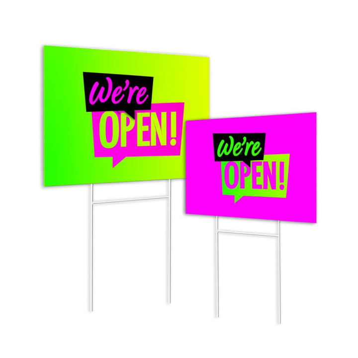
Direct answer: A We Are Open sign is most useful when someone has already reached the business but still needs confirmation. Prioritize the status word, place it where glare or door hardware will not interrupt it, and add hours or directions only when they remain readable.

Key takeaways

  • Treat OPEN as the first read; the logo and secondary detail should support it.
  • Check the sign from the real approach angle, not only from directly in front of the glass.
  • Use only current, customer-approved hours or access instructions, and plan how changing information will be updated.

Specs & options

Specs

Primary read
OPEN, WE ARE OPEN, or other customer-approved status language
Surface
Window, door, wall, counter, sign frame, or yard placement identified before quoting
View
Approach angle, distance, glare, obstructions, and available area
Change cycle
Permanent message, seasonal use, or information that needs updating
Artwork
Logo and brand files reviewed against the space available for the status message

Options

  • A window graphic for a direct storefront read
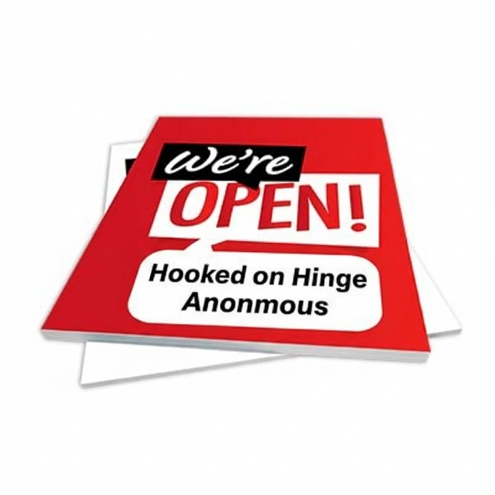
  • A rigid sign for a door, wall, easel, counter, or customer-supplied holder
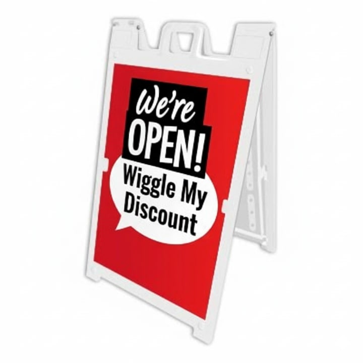
  • An A-frame when the message needs to sit closer to the pedestrian route
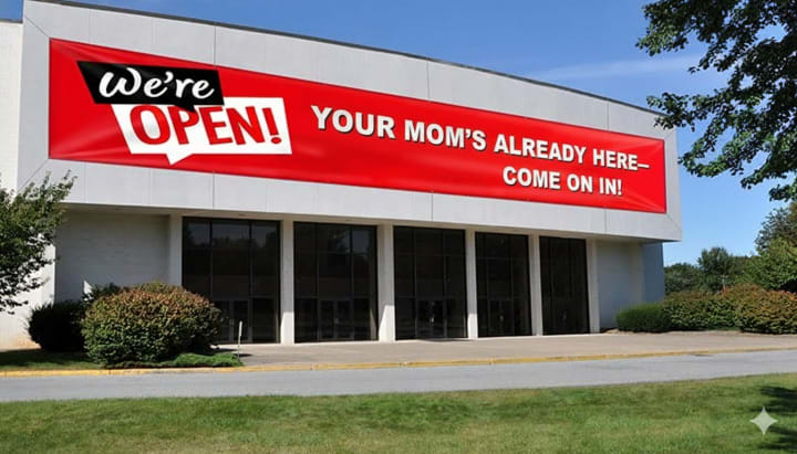
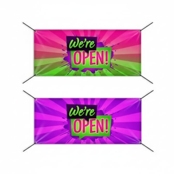
  • A banner or yard sign when the viewing point is farther from the entrance
  • A separate changeable element for hours or short-term information

Need help preparing files? See Artwork Setup.

Good fit for

  • A door or window where reflections make the business status uncertain
  • A counter or lobby that needs a compact arrival cue
  • A sidewalk display that confirms an entrance set back from the street
  • A seasonal operation whose open status changes during the year
  • An appointment-based business that wants concise, qualified wording

How it works

  1. 1) Photograph the entrance

    Share straight-on and approach-angle photos, usable dimensions, and notes about glass, hardware, glare, nearby signs, or landlord limits.

  2. 2) Supply the exact status

    Provide the approved headline, any current hours or access note, and the brand assets that belong in the layout.

  3. 3) Test the hierarchy

    Review the proof at a small scale to confirm that OPEN remains the first read and no required detail is lost.

  4. 4) Finalize the format

    The approved quote records the selected sign type, dimensions, finishing, production schedule, and any installation requirements.

FAQ

Should the sign say OPEN or WE ARE OPEN?

Use the shortest wording that fits the brand and context. OPEN is usually the fastest status cue; WE ARE OPEN can feel more conversational when the available space still gives it enough scale.

Can business hours go on the same sign?

Yes when they remain readable and are unlikely to become stale. If hours change often, a separate replaceable area or dedicated hours graphic may be easier to maintain.

What helps an open sign read through glass?

Strong contrast, adequate letter size, a clear area away from frames and handles, and a review from the actual approach angle. Photos taken at the intended viewing time also help identify glare and competing reflections.

Is a window decal always the best format?

No. Glass condition, property approval, desired viewing side, and the need to remove or update the message all affect the choice. A rigid panel or freestanding sign may suit some entrances better.

Can I match an existing storefront identity?

Send the logo, color references, type guidance, and a photo of the current signs. The proof can coordinate the new piece while keeping the open status visually dominant.