Quick answer

Direct answer: An acrylic sign is a good candidate for close-view branding when the panel itself should feel deliberate—clear, backed, printed, layered, or mounted away from the wall. A useful quote needs the finished size, artwork, background color, viewing conditions, and installation method.

Key takeaways

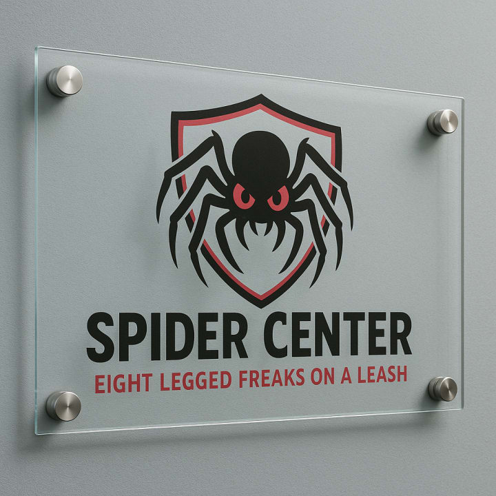
  • Transparency is a design decision: every unprinted area may reveal the wall and its shadows.
  • Fastener positions should be planned with the logo and margins, not added after layout approval.
  • Material thickness and finish are quoted after size, handling, exposure, and support are known.

Specs & options

Specs

Panel appearance
Clear, backed, or opaque-looking treatment established by the approved specification
Artwork
Vector files preferred for logos, lettering, cut paths, and precisely placed white layers
Edges and shape
Final profile, corner treatment, and cut details subject to production review
Background
Wall color, texture, and illumination reviewed as part of the sign composition
Mounting
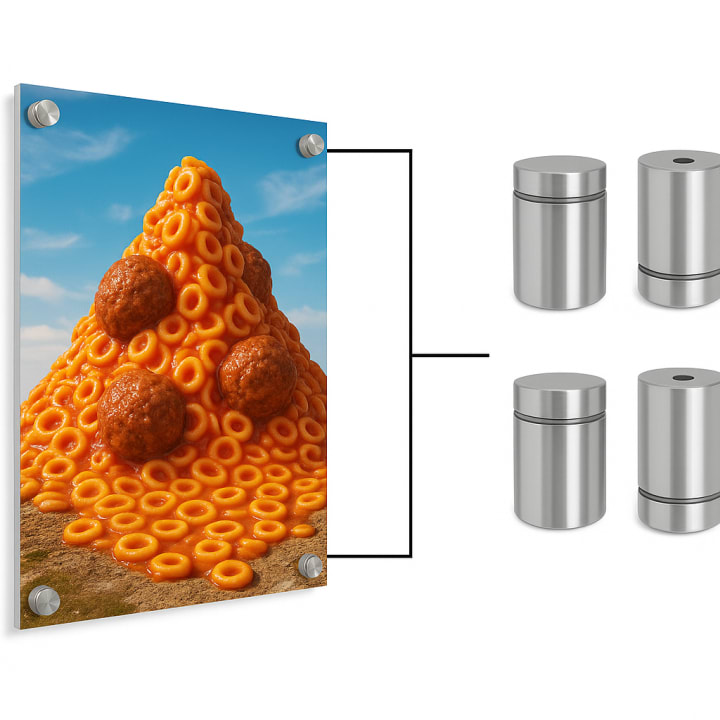
Standoffs, direct fasteners, or another project-specific method where appropriate
Expected service
Varies with the selected acrylic, graphics, exposure, mounting, cleaning, and handling

Options

  • Use selective white behind artwork while leaving planned portions visually open.
  • Add an overall backing treatment when wall color should not affect the design.
  • Place graphics on the back face when the approved design calls for viewing through the panel.
  • Create a contour profile from clean vector cut lines rather than a basic rectangle.
  • Coordinate standoff finish and spacing with the wall, sign scale, and logo clear space.

Need help preparing files? See Artwork Setup.

Good fit for

  • Reception logos where the mounting hardware can become part of the presentation
  • Room, suite, and directional panels read at walking distance
  • Counter displays and branded information panels for customer-facing interiors
  • Layered wall graphics that combine a panel, printed art, and visible background

How it works

  1. 1) Photograph the background

    Show the full wall or counter, nearby lighting, approximate placement, and any obstructions that could affect the sign.

  2. 2) Choose the visual treatment

    We translate the artwork into a clear, backed, layered, or opaque-looking concept and identify the panel and mounting questions.

  3. 3) Review the proof

    Approve the size, visible background, graphic orientation, cut shape, and fastener positions recorded for production.

  4. 4) Plan installation or handoff

    Access, wall construction, hardware, project timing, and the available delivery or installation scope are confirmed in writing.

FAQ

Will a clear acrylic sign look the same on every wall?

No. Paint color, texture, shadows, and lighting can change the appearance of transparent areas. A straight-on site photo and the wall color help us plan an appropriate backing and contrast strategy.

Can graphics be viewed through the front of the panel?

That is one possible construction. The artwork orientation, white layer, adhesive or print system, and cleaning exposure all need to be settled in the approved specification.

Where should standoff holes go?

Hole placement depends on panel size, logo clear space, edge distance, wall conditions, and the selected hardware. We prefer to resolve those positions in the proof instead of treating them as decoration.

Is acrylic appropriate outside?

Some acrylic sign specifications may suit particular exterior or protected placements, but the answer is project-specific. Share sun, weather, mounting, and cleaning conditions so the quote can identify the proposed build without promising a lifespan.

What files help with a shaped acrylic logo?

Vector AI, EPS, SVG, or PDF artwork gives the cleanest starting point for cut paths and sharp lettering. Include outlined fonts, linked-image files, and any brand color references you rely on.