
LED Module Spacing for Channel Letters: Even Light, Fewer Hot Spots
LED module spacing controls whether channel letters read cleanly after dark or show bright dots and shadowy gaps. This guide covers spacing math, face materials, power planning, and practical retrofit concerns for San Jose and South Bay storefronts.
Key takeaways
- LED spacing starts with letter depth: 4" depth often uses 4-6" spacing, 5" depth uses 6-8", and 6" depth uses 8-10".
- Face material changes the layout because white acrylic diffuses light differently than colored acrylic or polycarbonate.
- Wide strokes, tight corners, and multi-row letters usually need more careful module placement than simple narrow letters.
- Shallow channel letters and retrofit cabinets often need low-profile modules, wider beam angles, and better service planning.
- A bench test before installation is the best way to catch hot spots, dim corners, and uneven color early.
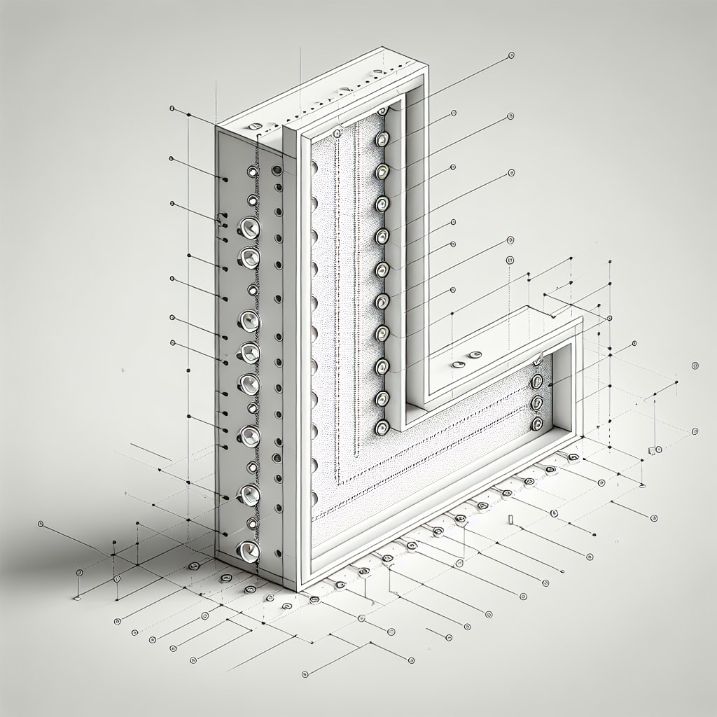
LED module spacing is one of the small technical decisions that becomes very visible once a channel letter sign turns on. Space the modules too close and the face can show bright dots. Space them too far apart and the sign may read with dim corners, shadowed strokes, or uneven color.
This guide breaks down the spacing calculations, material choices, and installation details that matter for illuminated signs around San Jose, Santa Clara, Sunnyvale, Mountain View, Palo Alto, Cupertino, Milpitas, and Fremont. Whether you are planning custom aluminum signs with lit accents or a full set of illuminated channel letters for a storefront, the same lighting principles apply.
Why does LED module spacing matter?
The spacing between LED modules determines how light mixes inside the letter before it reaches the translucent face. A good layout gives the beam enough room to spread across the cabinet. A poor layout makes the construction visible: bright spots over each module, darker gaps between rows, or uneven light near corners and returns.
According to Sign Builder Illustrated, LED spacing is one of the common technical questions manufacturers receive. That makes sense because every sign cabinet is a little different. Letter depth, stroke width, face material, return color, viewing distance, and existing electrical access all affect the final spacing.
What are the standard LED spacing guidelines by depth?
Letter depth is usually the starting point. Deeper letters give light more distance to spread and blend before it hits the face:
- 4-inch depth: Modules typically spaced 4-6 inches apart
- 5-inch depth: Modules typically spaced 6-8 inches apart
- 6-inch depth: Modules typically spaced 8-10 inches apart
- 8+ inch depth: Can use spacing up to 12 inches with high-output backlit modules
These guidelines assume standard SMD (surface-mount device) LED modules with beam angles around 120 degrees, which are common in channel letter fabrication. They are not a substitute for a test layout, especially when the sign has unusually narrow strokes, deep returns, halo lighting, or older cabinet conditions.
How does face material affect LED spacing?
The face material controls how much light passes through and how softly it diffuses. That changes the spacing requirement:
- White acrylic: Diffuses light well, allowing wider module spacing
- Colored acrylic: May require closer spacing to achieve adequate brightness
- Polycarbonate: Requires specific spacing based on thickness and transmission rating
Materials with lower light transmission often need more LEDs or closer spacing to stay readable from the street. Highly translucent materials may need fewer LEDs, but they can reveal hot spots if the modules sit too close to the face. The same practical material thinking applies when selecting substrates for Dibond signs or other displays that need to hold up in Bay Area storefront conditions.
What about shallow channel letters?
Shallow letters, often 2-5 inches deep, are common when a storefront has limited mounting depth, landlord restrictions, or an existing sign band that cannot accept a deeper cabinet. The challenge is simple: standard modules may not have enough mixing distance to blend evenly.
The usual solution is a low-profile module with a wider beam angle. Industry sources describe layouts in the range of 3.5-6 modules per foot for small, single-stroke letters. Useful options include:
- Batwing modules: Send light laterally while some reaches the face directly, covering 10-12 inch row spacing at 3-5 inch depths
- 180-degree beam modules: Direct light perpendicular to the face for 5-inch row spacing at 3-4 inch depths
- Low-profile nano modules: Designed specifically for shallow, single-stroke applications
How do wide letters and multi-stroke layouts affect spacing?
Letters with wide strokes, multiple rows, tight counters, or complex shapes generally require closer and more intentional LED placement. The reason is reduced internal reflection from the side walls, also called returns, compared with narrow single-stroke letters.
In a narrow single-stroke letter, light bounces off nearby side walls and helps fill the face. In a wide letter, there is more open space between returns, so the layout may need additional rows or staggered modules to avoid dark centers. This matters on bold retail names, restaurant signs, and medical or professional office signage where the letterforms are meant to look clean from a parking lot or commercial corridor.
What are the power supply considerations?
LED spacing directly affects power supply requirements. More modules mean more load, and that impacts:
- Consistent brightness: Properly rated power supplies maintain even illumination
- Long-term reliability: Undersized supplies cause premature failure
- Energy efficiency: Optimal spacing reduces module count without sacrificing quality
Per Wired4Signs USA, installation location also matters. A sign mounted above a busy San Jose storefront or along a wide commercial road may need different brightness planning than a small pedestrian-facing sign at eye level.
What factors should you consider before installation?
Beyond depth and face material, local installation conditions can change the best LED layout:
- Ambient light conditions: Bright retail centers and well-lit parking lots may need stronger output
- Viewing distance: Building-mounted signs need different brightness than close-range storefront letters
- Indoor vs. outdoor: Outdoor signs need modules and wiring rated for moisture and exposure
- Return color: White interiors reflect and distribute light better than dark returns
- Access and coordination: Landlords, property managers, and electrical access can affect how the sign is serviced later
What are professional installation best practices?
Experienced sign fabricators use a few practical steps to avoid expensive field surprises:
- Test before final assembly: Temporarily place modules and power them on to check for hot spots, dim corners, and color inconsistency
- Account for temperature and exposure: Outdoor signs in the South Bay see sun, cool nights, and seasonal rain, so components should be chosen accordingly
- Plan maintenance access: Design the sign so failed modules can be replaced without removing more of the sign than necessary
- Use manufacturer density guidelines: Most LED suppliers provide spacing recommendations for their specific modules
- Consider layout software: Tools like LED Wizard can automate spacing calculations based on stroke width and cabinet depth
These techniques apply whether you are fabricating a new illuminated sign or retrofitting existing sign installations with LED upgrades. Retrofit work often adds one more layer: the old sign cabinet may have uneven depth, aging faces, limited raceway space, or wiring that needs to be evaluated before the module layout is finalized.
Ready to start your channel letter project?
Proper LED module spacing helps illuminated signage look clean, readable, and consistent after dark. The calculation starts with letter depth, face material, and module beam angle, but the best layouts also account for viewing distance, access, cabinet condition, and how the sign will be maintained.
Need help designing illuminated channel letters for a San Jose or South Bay business? Start your project with San Jo Sign Co. We can help plan the technical details, including LED spacing, face material, power supply sizing, and installation coordination.