
Font Selection for Custom Signs That Need to Be Read Fast
Typography has to do two jobs on a commercial sign: express the brand and stay readable in real viewing conditions. The right font choice makes both happen at once.
Key takeaways
- Font choice affects both brand perception and practical readability, especially on busy San Jose streets and shopping corridors.
- For outdoor signs, plan around viewing distance, traffic speed, letter height, contrast, and the angle from which people will approach.
- Materials, lighting, and fabrication method can change how thin strokes, scripts, and small details look on the finished sign.
- Limit most signs to two fonts maximum: one for the main identity and one for supporting information.
- A professional sign maker can help align typography with brand tone, site conditions, landlord expectations, and installation constraints.
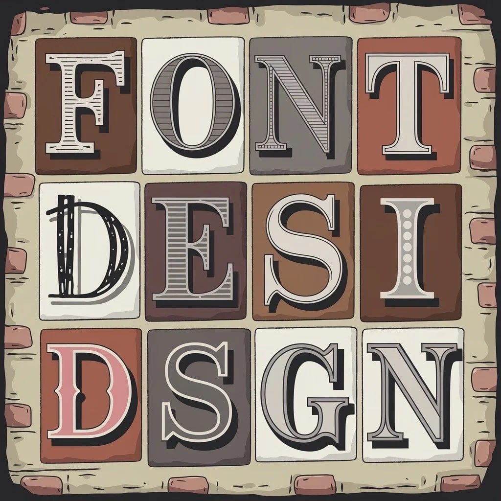
Typography shapes how people experience your sign before they consciously read it. The curves of a letter, the weight of a stroke, and the spacing between characters all influence whether someone reads your business as trustworthy, modern, playful, premium, or hard to understand. For San Jose businesses investing in custom signage, font selection is not just a design preference. It affects visibility from the sidewalk, recognition from a moving car, and how well the finished sign holds up across materials and lighting conditions.
Why does font selection matter for business signs?
Fonts are more than visual decoration. They are fast signals. According to Adobe's research on font psychology, different typefaces can affect the way people interpret tone, trust, and personality. When your sign's typography matches your brand, customers understand the business faster.
Consider two restaurants on the same commercial block. One uses a clean sans-serif font on its storefront; the other uses an ornate script. Before a customer reads the menu or steps inside, the signs create different expectations about atmosphere, price point, and service style. The same is true for dentists near Santana Row, cafes in downtown San Jose, salons in Santa Clara, and service businesses in Sunnyvale or Milpitas. Type sets the first impression.
How do different font styles communicate?
Each font category carries familiar associations. The goal is not to follow a rigid rule, but to choose a type style that fits the business and can be fabricated cleanly at the size and material you need.
Serif fonts: Trust and tradition
Serif fonts feature small finishing strokes at the ends of letters. Because they have a long history in print, they often suggest tradition, stability, and authority. Law offices, professional services, schools, financial firms, and established local businesses may use serif type to create a sense of reliability.
Sans-serif fonts: Modern and clean
Sans-serif fonts remove the decorative strokes, creating a cleaner and more direct appearance. They are common for technology companies, healthcare offices, fitness studios, retail storefronts, and modern restaurants because they feel straightforward and easy to scan. In Silicon Valley markets like Mountain View, Cupertino, Palo Alto, and San Jose, sans-serif typography is often the default starting point for brands that want a current, polished look.
Script fonts: Elegant and personal
Script fonts mimic handwriting and can communicate elegance, creativity, or a personal touch. They can work well for boutiques, bakeries, beauty businesses, wedding services, and shops that want a crafted feel. The tradeoff is readability. Script fonts should usually be reserved for short names or accent words, not long service lists or small secondary copy.
Decorative fonts: Distinctive but limited
Decorative and novelty fonts are designed to stand out. They can be useful for themed retail, entertainment, hospitality, or a short campaign message. They also carry the highest risk. If a letter shape is too unusual, people may slow down or misread the sign. Use decorative fonts for short text only, and keep essential information in a simpler companion font.
What makes a sign readable from a distance?
Beautiful typography is not enough if customers cannot read the sign in real conditions. According to industry guidelines from Signs.com, readability depends on letter height, contrast, viewing distance, and the way people encounter the sign.
Letter height and viewing distance
The standard rule is 1 inch of letter height for every 10 feet of viewing distance. If your storefront sign needs to be readable from 100 feet away, your primary text should start around 10 inches tall. For signs viewed by drivers on busy corridors like Stevens Creek Boulevard, El Camino Real, Monterey Road, or Capitol Expressway, increase the size because people have less time to process the message.
Color contrast
High contrast between text and background dramatically improves visibility. The most readable combinations pair light backgrounds with dark text, or dark backgrounds with light text. Avoid subtle pairings such as navy on black, gray on glass, or pale yellow on white. In the South Bay, direct sun, tinted windows, shadows from awnings, and evening glare can all change how a color combination performs.
Font weight and style
Medium and bold fonts usually outperform thin or decorative styles at distance. Clean serif and sans-serif fonts maintain legibility better than scripts or novelty fonts. Prioritize letterforms with distinct shapes so viewers can quickly tell similar letters apart, especially when the sign is seen through traffic, reflected glass, or a crowded streetscape.
Environmental factors
Consider where the sign will be displayed. A blade sign for sidewalk traffic has different needs than a wall sign above a storefront or a lobby sign behind a reception desk. Signs in direct sunlight need enough contrast to avoid washing out. Signs mounted above eye level need larger text than signs placed straight ahead. Window graphics may need bolder type because reflections, tint, and interior lighting compete with the lettering.
How do materials and fabrication affect font choice?
A font that looks sharp on screen may need adjustment before it becomes a physical sign. Thin strokes can disappear when cut from vinyl. Tight counters, such as the inside spaces of letters like "a" and "e," can fill in visually when letters are small. Very narrow scripts can be fragile in dimensional materials. Illuminated signs may need wider strokes and cleaner spacing so the glow does not blur the letter shape.
Material choice matters too. Acrylic, aluminum, painted panels, window decals, banners, and dimensional letters each handle detail differently. A refined serif may work beautifully on a lobby sign but need simplification for a large exterior panel. A casual script may look right for a bakery window, while the same font could be hard to read on a banner facing moving traffic in Fremont or Milpitas.
How do you match fonts to brand identity?
The most effective sign typography aligns with your overall brand strategy. Start with the attributes you want people to feel immediately. Is the business precise or playful? Premium or accessible? Technical or handmade? Calm or energetic? Then choose fonts that reinforce those traits without sacrificing legibility.
A medical office in Palo Alto might use a clean sans-serif to feel calm and current. A long-running repair shop in San Jose might choose a strong, practical typeface that feels established and easy to read. A children's activity center could use a playful display font for the name while keeping hours, suite numbers, and wayfinding in a simpler supporting font.
When in doubt, limit the sign to two fonts: one for the main identity and one for supporting text. This creates hierarchy without the clutter that comes from mixing too many typefaces.
What about custom fonts versus standard fonts?
Custom-designed fonts can give a brand a unique identity, but they require more time, testing, and budget than most single-location sign projects need. They can also create fabrication issues if the letterforms were not designed with signage in mind.
For most businesses, the existing type library offers more than enough strong options. A skilled sign designer can identify typefaces that match your brand while making sure they perform in the specific application, whether that is an acrylic lobby sign, a set of window graphics, exterior dimensional letters, or a grand opening banner for a new location.
How can you avoid common font mistakes?
Even a well-intentioned sign project can lose impact when the typography is not planned for the real site. Watch out for these frequent issues:
- Too many fonts: Using more than two typefaces creates visual noise. Stick to one primary font and one supporting font for most signs.
- Prioritizing style over readability: A beautiful script font does not help if customers cannot read the business name from across the street.
- Ignoring viewing distance: Text that looks perfect on a computer screen may be too small once it is installed on a building, window, monument, or roadside panel.
- Forgetting fabrication limits: Thin strokes, tiny gaps, and complex flourishes may not translate well to cut vinyl, dimensional letters, or illuminated signage.
- Mismatched tone: A playful display font on a professional services sign, or a formal serif on an energetic retail concept, can make the brand feel confused.
- Poor color contrast: Subtle color combinations can fail in direct sun, low light, rain, shadows, or reflective glass.
What should San Jose businesses consider before approving a font?
Before final approval, review the font in context. Look at the sign mockup at realistic scale. Consider whether it will be read from a parking lot, a sidewalk, a moving car, or a building entrance. If the sign is part of a multi-tenant property, coordinate with landlord guidelines early so the typography, size, colors, and materials fit the property standards.
Businesses in San Jose, Santa Clara, Sunnyvale, Mountain View, Cupertino, Palo Alto, Milpitas, and Fremont often deal with a mix of storefront glass, stucco facades, business parks, shopping centers, and high-traffic corridors. A font that works in a quiet interior lobby may need more weight, spacing, or contrast outdoors. Testing those details before production saves time and helps the finished sign do its job.
Ready to create signage that communicates your brand?
Font selection is one of many decisions that shape how your sign performs in the real world. San Jo Sign Co helps San Jose and South Bay businesses create custom signage that communicates clearly, fits the property, and reinforces the brand. Our team can guide typography choices, material selection, production details, and professional installation so the finished sign is readable, durable, and appropriate for the location.
Start your project today, or contact us to talk through your signage needs.