
The Practical Elegance of a Custom Acrylic Office Sign
A practical look at how acrylic, laser etching, and mounting details shape a polished office sign for San Jose workplaces.
Key takeaways
- Blue Plexiglas (acrylic) gives office signs glass-like clarity without the weight or fragility of glass
- Laser etching creates a frosted logo effect that reads well in lobbies, hallways, and suite entries
- Black walnut mounting hardware adds warm contrast while keeping the sign refined and durable
- Material choice, mounting style, and viewing distance all matter in San Jose office signage
- A simple office sign works best when fabrication details support everyday wayfinding and brand presentation
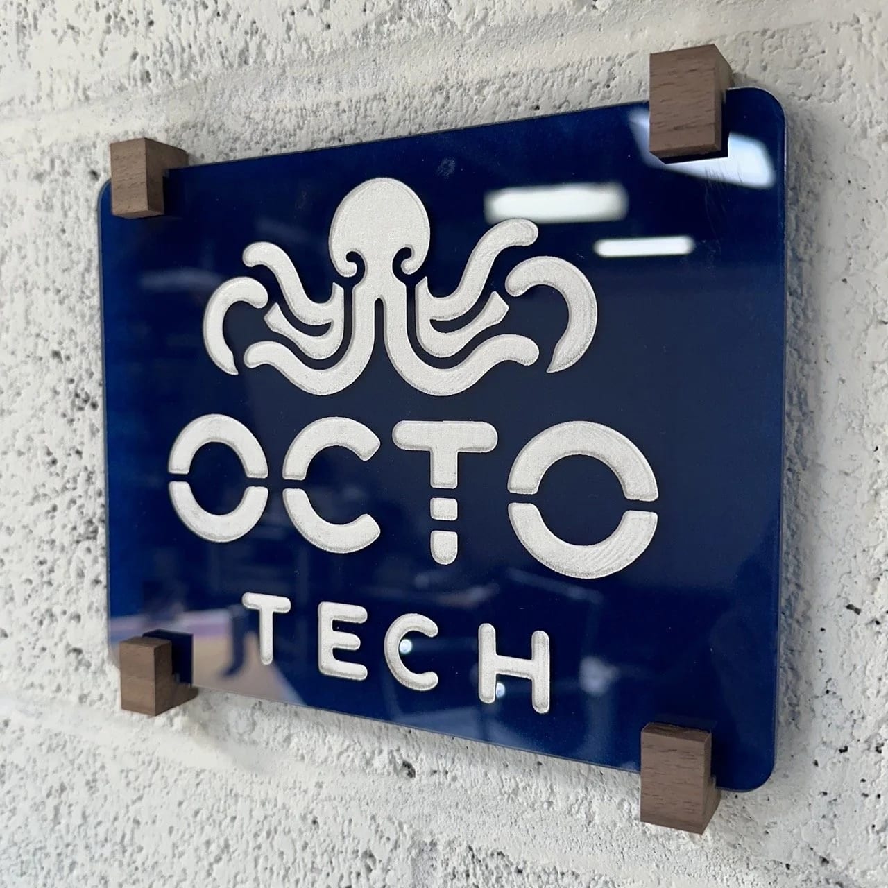
A good office sign does not need to be loud to be effective. For a San Jose workplace, a suite placard has to identify the business clearly, fit the building environment, and look finished up close. This blue acrylic sign shows how a simple panel, precise logo treatment, and well-chosen mounting details can create a polished first impression without overcomplicating the design.
Why Blue Plexiglas Works for Office Signage
The foundation of this sign is a sheet of blue-tinted Plexiglas (acrylic), selected for both its visual presence and practical material qualities. According to Erie Industrial Plastics, acrylic offers glass-like clarity, brilliance, and transparency at roughly half the weight of glass, with substantially better impact resistance.
The blue color gives the sign an immediate identity, while the material's inherent durability makes it a strong fit for reception areas, office corridors, conference rooms, and tenant suite entries. In San Jose, Palo Alto, Santa Clara, Sunnyvale, and Mountain View, many offices have bright interiors, glass partitions, and shared hallways; acrylic fits those environments because it looks crisp without feeling bulky.
The rounded edges also matter. They soften the panel visually and make the sign feel more approachable, which is useful in offices where employees, clients, vendors, and visitors pass by the sign every day.
How Laser Etching Creates the Logo Effect
The logo is rendered through precision laser etching, which removes material from the acrylic surface to create a frosted appearance. That frosted area catches light differently than the glossy blue background, so the mark remains visible from multiple angles as people move through a lobby or hallway.
For stronger visibility, the etched logo can be paint-filled after etching. That extra step helps the branding stay clear under common office lighting conditions, especially in glass-heavy spaces or corridors where reflections can make subtle graphics harder to read.
Why Black Walnut for Mounting Hardware?
The black walnut mounting hardware gives the sign a warmer, more crafted feel than standard metal standoffs would. According to The Wood Database, black walnut has a Janka hardness rating of 1,010 lbf and is rated as very durable in terms of decay resistance.
The dark chocolate-brown color of the wood provides contrast against the blue Plexiglas without overpowering it. Black walnut's natural grain pattern, usually straight with occasional irregular movement, adds visual interest while keeping the finished sign refined enough for a tech office, design studio, medical office, or professional services suite.
Beyond appearance, the mounting approach affects how the sign performs day to day. Office signs in Cupertino, Milpitas, Fremont, and the South Bay often need to work within landlord finish standards, existing wall surfaces, and tenant improvement schedules, so the hardware needs to look intentional and install cleanly.
What Goes Into Fabricating This Type of Sign?
Creating a sign like this requires several precision processes:
- Precision cutting: The acrylic sheet is cut to exact dimensions, with rounded corners shaped consistently from edge to edge
- Laser etching: The logo is etched with clean lines and controlled depth so the mark reads clearly
- Paint filling: The etched area is filled carefully when stronger contrast is needed for daily visibility
- Hardware fabrication: The walnut mounting pieces are shaped, finished, and sized to complement the acrylic panel
- Assembly: The acrylic, logo treatment, and mounts are aligned so the final piece feels cohesive rather than pieced together
Each step affects the finished result. A slightly uneven corner, a shallow etch, or a poorly matched mount can make an otherwise clean office sign feel unfinished. That level of detail matters most on interior signs because people see them from just a few feet away.
What San Jose Businesses Can Learn from This Sign
This office sign demonstrates that effective workplace signage does not have to be elaborate. The real value comes from matching the material, finish, mounting style, and viewing conditions to the space. A sign at a suite entry in downtown San Jose may need to feel different from signage in a North San Jose office park, a Santana Row-adjacent retail service business, or a shared professional building near Santa Clara.
For Bay Area businesses considering new office signage, this project offers several practical takeaways:
- Premium materials like acrylic and hardwood can make a small sign feel substantial
- Simple designs often work best when the fabrication is precise
- Color choices should support the brand while staying readable in the actual space
- Mounting decisions should account for wall material, landlord expectations, and viewing distance
- Durability matters even indoors because office signs are handled, cleaned, and seen every day
If you're planning a similar sign for an office in San Jose or one of the listed Silicon Valley service areas, our team can help balance brand presentation with practical fabrication and installation details. Start your project to discuss your space, or explore our professional installation services for help with placement and coordination.