
How Color Theory Shapes Effective Sign Design
Color is not just decoration. It affects how quickly a sign is noticed, whether it can be read from the street, and how customers in San Jose read your brand.
Key takeaways
- Strong color choices help storefronts, offices, and vehicle graphics get noticed in busy San Jose commercial corridors.
- WCAG accessibility guidance recommends at least 4.5:1 contrast for normal text and 3:1 for large text, which is a useful benchmark for signs too.
- High-contrast combinations such as black on white, white on dark blue, and yellow on black stay readable in sun, shade, and evening light.
- Brand colors need practical adjustments across aluminum, acrylic, vinyl, illuminated signs, and window graphics.
- In diverse South Bay markets, color meaning, visibility, and neighborhood context all matter.
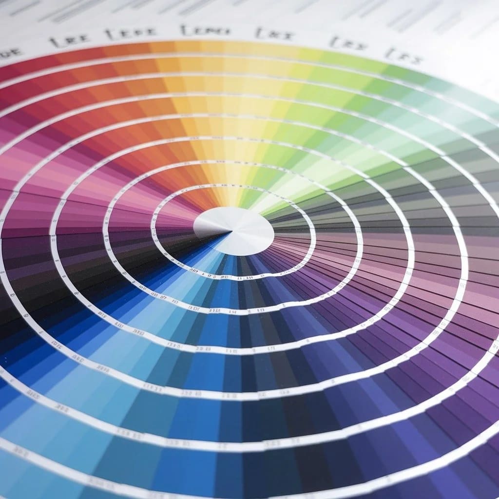
Color theory is one of the practical foundations of effective sign design. It determines whether a San Jose business sign stands out on a busy corridor, whether drivers and pedestrians can read it quickly, and whether the finished piece feels aligned with the brand. Good color decisions are not just artistic choices. They affect visibility, trust, wayfinding, and the durability of the design over time.
Research cited by the Institute for Color Research suggests that people make subconscious judgments about products within 90 seconds of seeing them, and a large share of that assessment is influenced by color. For a storefront, office, restaurant, clinic, or service business, that means color choices can influence whether someone notices the sign, understands the offer, and feels comfortable taking the next step.
Why does contrast matter more than any other factor?
Contrast is the first test of sign readability. A design can look polished on a laptop screen and still disappear once it is mounted on a wall, placed behind glass, or viewed from a moving car. In areas such as Stevens Creek Boulevard, The Alameda, North First Street, El Camino Real, and downtown San Jose, signs compete with traffic, trees, awnings, reflections, and neighboring storefronts.
The Web Content Accessibility Guidelines (WCAG) provide useful benchmarks: text should have a contrast ratio of at least 4.5:1 against its background for normal-sized text, and 3:1 for large text. These standards were created for digital content, but they are also a helpful reference for physical signage because the goal is the same: make the message readable for as many people as possible.
Reliable high-contrast combinations for outdoor business signs include:
- Black on white or white on black for maximum separation between message and background
- Yellow on black for strong attention and visibility when used with restraint
- White on dark blue for a clean, professional look that remains readable
- Dark lettering on light backgrounds for many exterior panels, wall signs, and window graphics
When planning custom aluminum signs for businesses in San Jose, Santa Clara, Sunnyvale, Mountain View, Cupertino, Milpitas, Fremont, and Palo Alto, contrast should be reviewed before production. The sign needs to hold up visually in bright South Bay sun, late afternoon glare, shaded storefronts, and evening conditions under building lights or streetlights.
How does color psychology influence customer perception?
Colors create quick associations before someone reads a full line of text. Those associations are not rigid rules, but they help shape how a business feels from the street. The right palette should support the brand, the type of customer, and the setting where the sign will be installed.
Red communicates urgency, energy, and appetite. It can work well for restaurants, retail promotions, fitness businesses, and any sign that needs a strong point of emphasis. In a busy shopping center, a red accent can help a name or offer stand out without overwhelming the full design.
Blue conveys trust, stability, and professionalism. It is common for medical offices, financial services, professional firms, and technology companies across San Jose and the Peninsula because it feels steady and familiar. Darker blues can also provide strong contrast for white or light lettering.
Green signals health, growth, freshness, and environmental awareness. It is a natural fit for wellness businesses, food brands, landscaping companies, outdoor services, and organizations that want a calm, restorative feel.
Yellow suggests energy and optimism, but it needs control. Large yellow fields can create glare in direct sun, while yellow accents or yellow lettering on a dark background can be highly visible.
Black adds weight, simplicity, and polish. It works for restaurants, salons, professional offices, boutiques, and modern tech-adjacent brands. It also creates dependable contrast with white, metallic finishes, bright accents, and many vinyl colors.
What color schemes create visual harmony?
The color wheel remains a useful guide because it helps organize relationships between colors. For signs, the goal is not to create a complex palette. The goal is to choose a limited set of colors that makes the message easy to read and the brand easy to recognize.
Complementary schemes pair colors opposite each other on the wheel, such as blue and orange. These combinations can create strong energy and visibility. They are useful when a sign needs to stand apart from a plain building facade, but they should be balanced so the design does not feel noisy.
Analogous schemes use colors next to each other on the wheel, such as blue, blue-green, and green. They create a calmer, more unified impression. This approach can work well for clinics, offices, schools, and service businesses that want the sign to feel stable and organized.
Monochromatic schemes use different tints and shades of one color. They can look refined, but they still need clear value contrast. A light blue background with slightly darker blue lettering may look tasteful up close but become hard to read from the parking lot.
A study from the University of Loyola, Maryland found that color can increase brand recognition by up to 80%. For a business with storefront signs, lobby signs, window decals, banners, and vehicle graphics, consistent color choices help customers connect those touchpoints back to the same company.
How should you approach accessibility in sign design?
Accessible sign design helps more people understand the message, including customers with low vision or color vision deficiency. It also tends to make the sign better for everyone, because the same decisions that improve accessibility usually improve distance readability.
Key accessibility practices include:
- Do not rely on color alone to communicate important information. Use words, icons, arrows, patterns, or layout as support.
- Maintain strong contrast between copy and background, especially for phone numbers, suite numbers, hours, and directional signs.
- Avoid difficult color pairings such as red-green when the difference between the two colors carries meaning.
- Test the design at the real viewing distance, not only on a close-up proof.
For professional sign installation, accessibility should be considered before fabrication and mounting. That includes color, letter size, placement height, lighting, sightlines, and whether the sign is being viewed from a sidewalk, driveway, lobby, hallway, or roadway. Exact requirements can vary by property and jurisdiction, so early coordination with landlords, property managers, or local reviewers can prevent avoidable revisions.
What about brand consistency across different sign types?
Your brand colors should stay consistent across exterior signs, interior wayfinding, window graphics, banners, wall lettering, and vehicle graphics. At the same time, each format has different practical constraints. A color that looks sharp on a website may need a slightly different treatment on cut vinyl, printed aluminum, acrylic, or illuminated sign faces.
Color shifts by material and environment:
- Digital screens (RGB) use light, so colors often look brighter than finished materials
- Printed materials (CMYK) use ink, which can look more muted depending on the substrate
- Vinyl films and paints have specific color ranges, gloss levels, and finish options
- Illuminated signs can look different during the day than they do at night
- Outdoor signs change visually with sun exposure, shade, rain, haze, and reflections from nearby glass
If your business has Pantone, CMYK, RGB, or hex color values, share them with your sign maker. Those values are a starting point, not a guarantee that every material will match perfectly. Physical samples, proofs, and finish choices help keep the finished sign close to the brand while still making it readable in the field.
How do cultural factors affect color choices in diverse markets?
San Jose and the surrounding South Bay are culturally diverse, so color can carry different associations for different audiences. This does not mean every sign needs to be redesigned for every possible interpretation, but it does mean color should be chosen thoughtfully when a business serves a specific community or neighborhood.
White can suggest cleanliness and simplicity in many Western brand contexts, but it can also feel stark or carry different cultural meanings depending on the audience.
Red can signal urgency or warning in some contexts, while also representing luck, celebration, and prosperity in others. For businesses serving Asian communities in San Jose, Cupertino, Milpitas, Fremont, and nearby cities, red may be a positive and familiar brand color when used appropriately.
Yellow can suggest caution in traffic and safety contexts, but it can also feel warm, energetic, or optimistic in retail and restaurant signage.
The practical move is to understand the audience, the location, and the sign's purpose. A color palette for a quick-service restaurant on a busy road may need more energy than a palette for a professional office near a business park or a medical suite in a multitenant building.
What practical steps should you take?
Applying color theory to a real sign project starts with a few grounded decisions:
- Define the job of the sign. A primary storefront sign, parking sign, lobby sign, banner, window decal, and directional sign each has a different viewing distance and message hierarchy.
- Look at the installation environment. Note the building color, neighboring signs, glass reflections, shadows, landscaping, and typical approach direction.
- Start with legibility. Choose the copy color and background color before adding accents, textures, or decorative effects.
- Account for materials. Matte, gloss, metallic, translucent, and illuminated finishes all change how color behaves.
- Review with the right parties early. Landlords, property managers, franchise teams, and local reviewers may have color, size, or placement preferences.
- Use proofs and samples. Screen previews are helpful, but physical materials are the better reference before final production.
Whether you are opening a storefront in San Jose, refreshing office signage in Palo Alto, adding window graphics in Santa Clara, updating a retail sign in Sunnyvale, or planning vehicle graphics for a service business in Fremont, color decisions directly affect how well the sign performs. The best sign colors are not just attractive. They are readable, durable, brand-aware, and appropriate for the place where the sign will live.
Ready to discuss your sign project? Start your project with San Jo Sign Co, or view our gallery to see how color, materials, and placement work together across Bay Area signage.